Spatial Intelligence
Transformed a data-heavy reporting tool into a map-driven intelligence platform — introducing interactive layers, geospatial exploration, and flexible map-panel workflows that changed how enterprise users see and make decisions with real estate data.
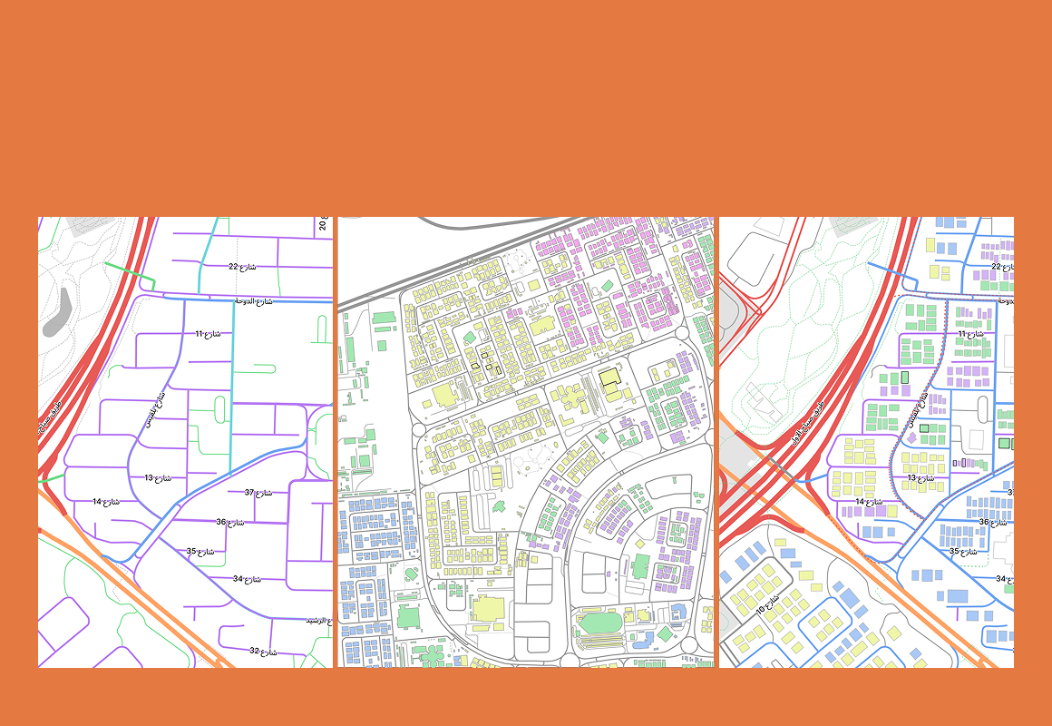
Real estate is inherently spatial. The product wasn't.
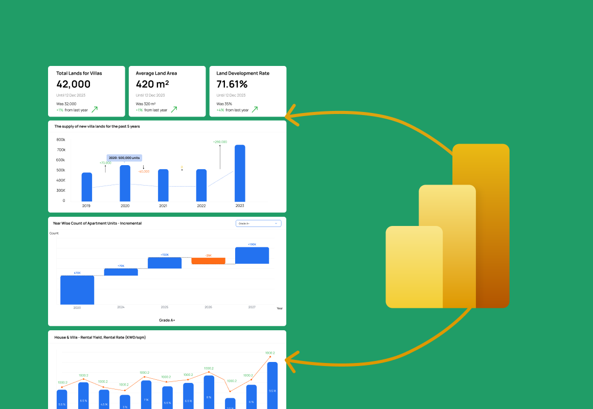
When I inherited the Markets UX, the platform had no map experience at all. Users navigated entirely through tables, charts, and filtered reports — analytical tools that answered what, but never where.
For real estate professionals, this is a fundamental gap. A transaction price means almost nothing without geographic context. A price-per-sqft figure is abstract until you can see which neighborhoods are high, which are flat, and where the edges are. The product was communicating data without communicating reality.
Without location context, insights stayed abstract.
The absence of spatial interaction wasn't just a feature gap — it was a thinking gap. Users couldn't pattern-match across geography. They couldn't compare regions intuitively. They had to build mental models that the product should have been building for them.
"Add a map" was the brief. The real problem was much harder.
Adding a map is straightforward. Adding a map that makes complex real estate datasets explorable, without overwhelming users, across five distinct enterprise user types, while maintaining performance under dense data loads — that's a different problem entirely.
Three principles that kept the map from becoming noise
Spatial data tools fail in one of two ways: they're too simple to be useful, or too complex to be approachable. The design strategy for this project was built around avoiding both failure modes simultaneously.
The brief was "add a map." I pushed back: a map bolted onto a reporting tool would just add clutter. I made the case to treat it as a spatial-thinking problem — an integrated map, filter, and panel loop with progressive disclosure that served five very different user types without a single onboarding screen. That reframing is what made it the product's #1 differentiator instead of just another feature.
Five solutions that turned a reporting tool into a spatial intelligence platform
Map + Panel Dual Interface
Introduced a three-mode flexible layout that respected how different users actually think. Rather than forcing a single workflow, the interface adapted to the task.
↑ Both geographic and analytical users served natively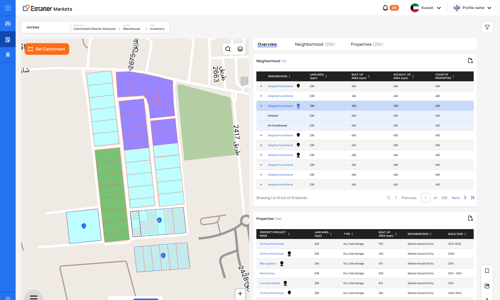
Interactive Map Layers
Introduced a configurable layer system that let users build up geographic context incrementally — starting with a clear base view and adding analytical layers one at a time. Each layer reveals a different dimension of the market.
Avg. 2.8 layers active per enterprise session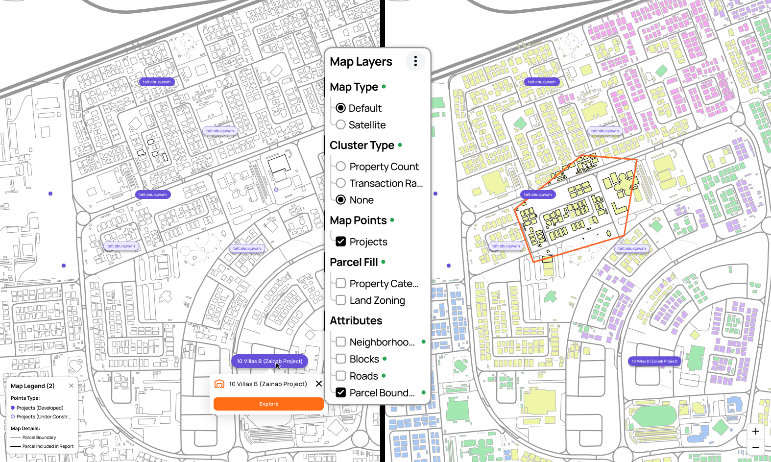
Visual Data Interpretation
Moved data from table rows into the map canvas itself — visualizing price intensity, transaction density, and zoning status as spatial phenomena rather than numerical records. The insight doesn't require interpretation; it's immediately visible.
Insight time: 30–45 min → under 5 minMap + Filter Integration
Connected the map and the filter/data panel into a single exploration loop — so neither component felt like a separate tool. Filters didn't just narrow a report; they updated the map in real time. And map interactions didn't just zoom in; they surfaced relevant data in the panel automatically.
↑ Exploration flow — no more context-switching between map and reportsProgressive Complexity — Designed for Multiple Skill Levels
Five enterprise user types span a wide range of spatial literacy — from government analysts who use GIS tools daily to developers who primarily think in square footage and ROI. The design was built to be immediately useful to all of them, without requiring a tutorial or onboarding sequence.
Zero onboarding required across all three user levels — progressive disclosure did the teaching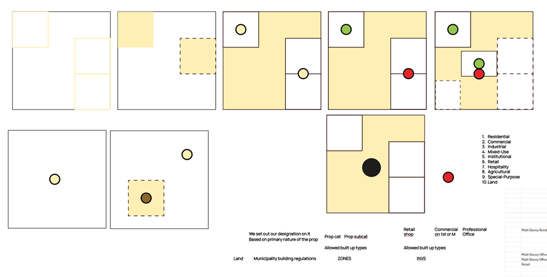
The most transformative UX improvement in Markets' product history
The spatial intelligence layer didn't just improve an existing feature — it added an entirely new mode of product interaction that users hadn't been able to imagine before they saw it.
Users stopped consuming pre-built reports and started investigating. The map interface invited a different mode of engagement — one where users drove the analysis rather than reading the output of someone else's decisions about what to show them.
For valuation and lending decisions that previously required extended table analysis, spatial visualization cut the cognitive work of geographic understanding from 30–45 minutes to under 5. For high-volume enterprise users, that multiplies across dozens of decisions per week.
In enterprise sales conversations, the map intelligence layer became the most frequently cited reason for selecting Markets over alternatives. Competitors offered tables and charts — this was spatial context. That distinction mattered at the procurement level.
The layer architecture was designed to be extensible. New data layers — planning authority data, infrastructure proximity, ownership density — could be added and monetized independently, creating a path to new revenue streams that didn't exist in the original product structure.
GIS UX at enterprise scale is a rare skill. Most portfolios don't show it.
Spatial interface design is a distinct discipline — it combines information architecture, data visualization, interaction design, and performance UX in a domain where bad decisions have real cognitive consequences for high-stakes professional workflows.
What made this technically and conceptually hard
Visual context doesn't simplify data. It changes how you think about it.
When dealing with complex data, visual context reduces cognitive load more than simplification alone. Maps don't just display data — they change the kind of thinking that data enables.
The most unexpected outcome of this project was watching users ask completely different questions once the map was in their hands. Before, they asked "what are the prices in Zone 4A?" After, they asked "why does that corridor have higher intensity than the areas around it?" The visualization didn't just speed up existing analysis — it prompted analysis that wasn't happening before.
That's the deepest version of what good data UX can do: not just surface what's already known, but create the conditions for users to discover something they didn't know to look for.