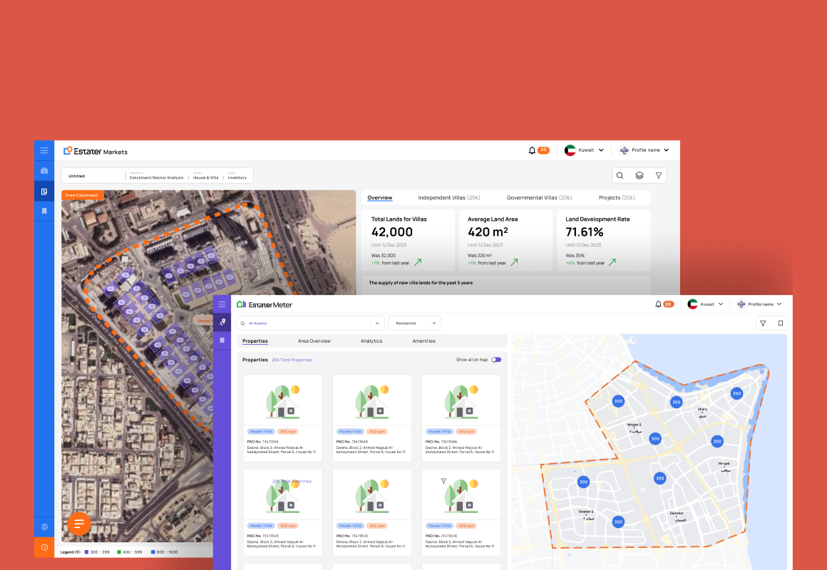
Estater × Power BI
Redesigned the reporting workflow by integrating Power BI into the Markets platform — cutting report turnaround from full sprint cycles down to minutes, while working within strict third-party UI constraints.
As the platform grew, reporting couldn't keep up
After Markets evolved into a more advanced analytics platform, demand for report updates and customizations accelerated significantly. The problem was that the reporting infrastructure hadn't evolved alongside the product — every change, however small, required a full engineering sprint.
Business and data teams had the knowledge to iterate on reports themselves. The product just didn't give them the tools to do it. The gap between what users needed and what the team could ship was growing.
Two problems in tension: agility and consistency.
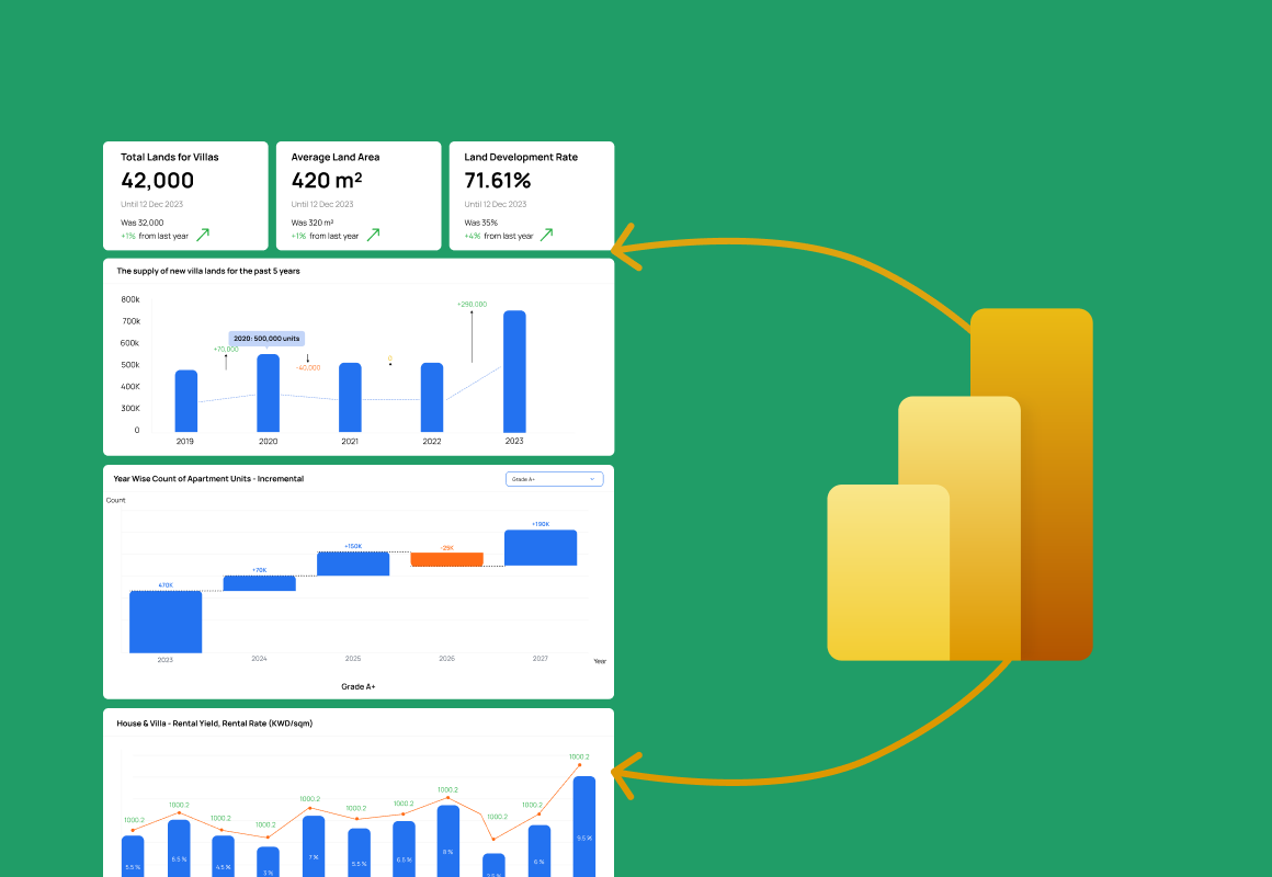
Power BI offered a clear path to speed — it would let the data team iterate on reports without engineering involvement. But embedding a third-party BI tool into a polished product experience isn't as simple as dropping in an iframe. Power BI has its own UI patterns, interaction behaviors, and visual language that can jar against a carefully designed product.
Don't fight the constraint. Design around it.
The instinct with third-party integration is to try to make the embedded tool look like the host product. But that's a losing battle — you'll always be fighting the tool's defaults. Instead, I designed a strategy around four principles that worked with Power BI's constraints rather than against them.
The purist instinct was to fight for pixel-level control over the embedded reports. I made the opposite call — deliberately trading some visual control in the rigid middle for radical operational speed, and designing the Markets-native frame around it so users never felt the loss. I had to defend that trade to design-minded stakeholders as strategy, not a shortcut.
Four solutions that made a third-party tool feel like a first-party one
Seamless BI Embedding
Power BI dashboards were embedded into Markets within a carefully designed container — not dropped in as iframes. The entry points, loading states, and exit paths were all designed within the Markets system, so users moved into and out of BI content without feeling like they'd left the product.
↑ Zero "tool switch" perception in user sessions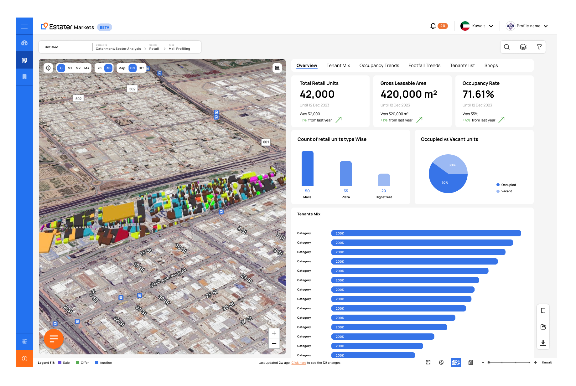
Unified Interaction Layer
The hardest part of third-party integration is the moment a user crosses into different behavior. We solved this by aligning the key interaction touchpoints — filters, navigation patterns, and layout rhythm — between the native Markets UI and the Power BI embeds.
↓ User confusion at native-to-BI transition points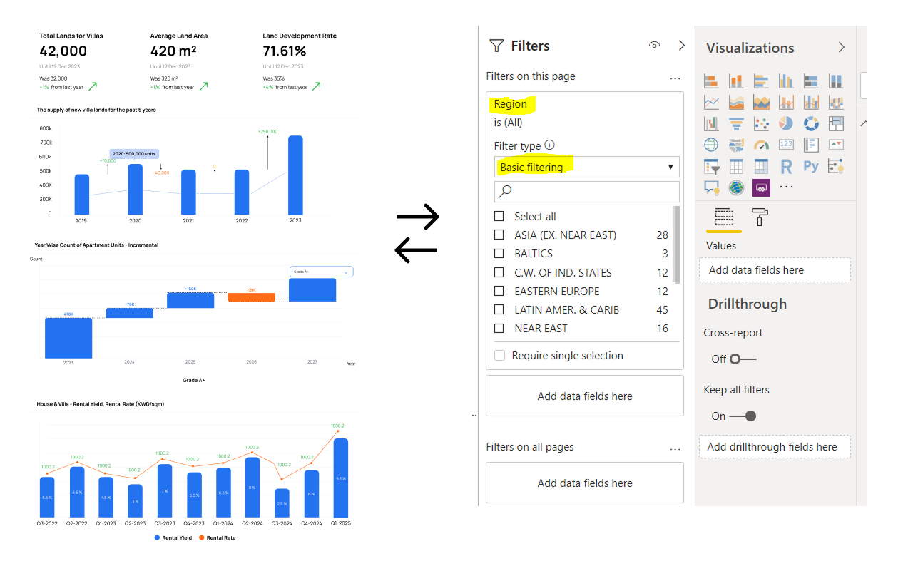
Rapid Report Editing Workflow
The primary operational win of the integration — reports could now be updated directly in Power BI Desktop by the data team, published, and reflected in Markets within minutes. No sprint scheduling, no engineering tickets, no waiting.
From 2–3 week sprints → under 15 minutes per update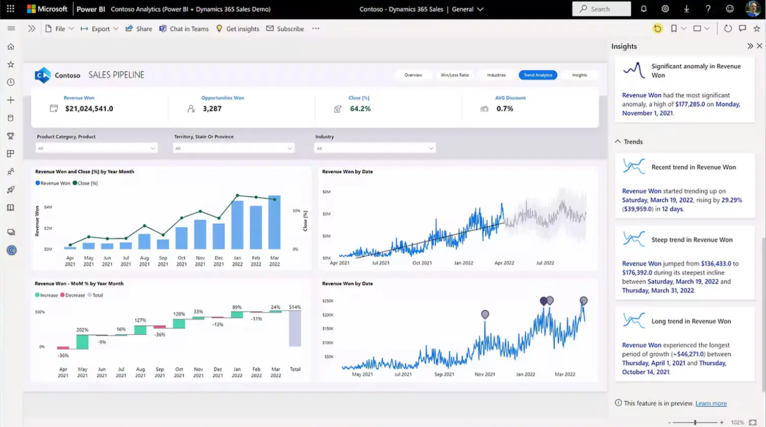
UX Design Around Constraints
Where Power BI's UI couldn't be changed, we controlled what surrounded it. This meant deliberately designing the entry experience, loading state, error handling, and exit path within the Markets system — so the rigid middle didn't define the user's overall perception of the flow.
↑ Consistent perception of product quality despite third-party constraints
The most operationally impactful change the product team had shipped
The gains here weren't about new features or redesigned flows — they were about fundamentally changing how fast the team could respond to user needs. For an enterprise analytics product, that speed became a competitive advantage.
With the bottleneck removed, the data team moved from quarterly report cycles to weekly — and in some cases daily — updates. Enterprise clients received fresher data without waiting for engineering cycles to close.
By moving report ownership to the data team, the engineering team recovered significant sprint capacity. Instead of fielding report update tickets, they could focus on the platform capabilities that required actual development work.
The data team could now test new report structures, try different visualizations, and iterate on data storytelling without the overhead of a full feature request. This unlocked a meaningful cultural shift toward data-driven product improvement.
Clients who previously waited weeks for custom report adjustments could now receive updates within the same business day — a change that directly improved perceived product quality and client satisfaction.
Most designers design ideal systems. This shows how to design practical ones.
The Power BI integration project is about a specific kind of design skill that doesn't always appear in portfolios: designing well within real-world constraints, with third-party tools, for operational outcomes rather than feature launches.
What made this genuinely hard
Speed isn't the opposite of quality — it's a design requirement in its own right.
Design is not always about control. Sometimes it's about enabling the right outcome within the constraints that exist — not the constraints you wish you had.
This project challenged me to let go of the instinct to fully control the visual output. In an ideal world, every pixel in a product experience would be intentional. In practice, the most valuable thing I could do was design the system around the embedded tool well enough that users never felt the loss of that control.
It also reinforced something I believe deeply about enterprise UX: operational speed is a user experience. A platform that updates in 15 minutes feels more alive, more responsive, and more trustworthy than one that takes three weeks — regardless of how polished either one looks.