Designing for Revenue
Introduced monetizable product capabilities by enabling premium map layers and API-based data access — turning Markets from a self-contained tool into a scalable revenue platform that delivered value both inside and outside the product interface.
The product was strong. The revenue model wasn't keeping up.
By the time Markets had evolved into a map-driven analytics platform with layered data visualization, custom reporting, and sandbox workflows — a new realization was becoming clear. The intelligence the product contained was more valuable than the subscription price implied.
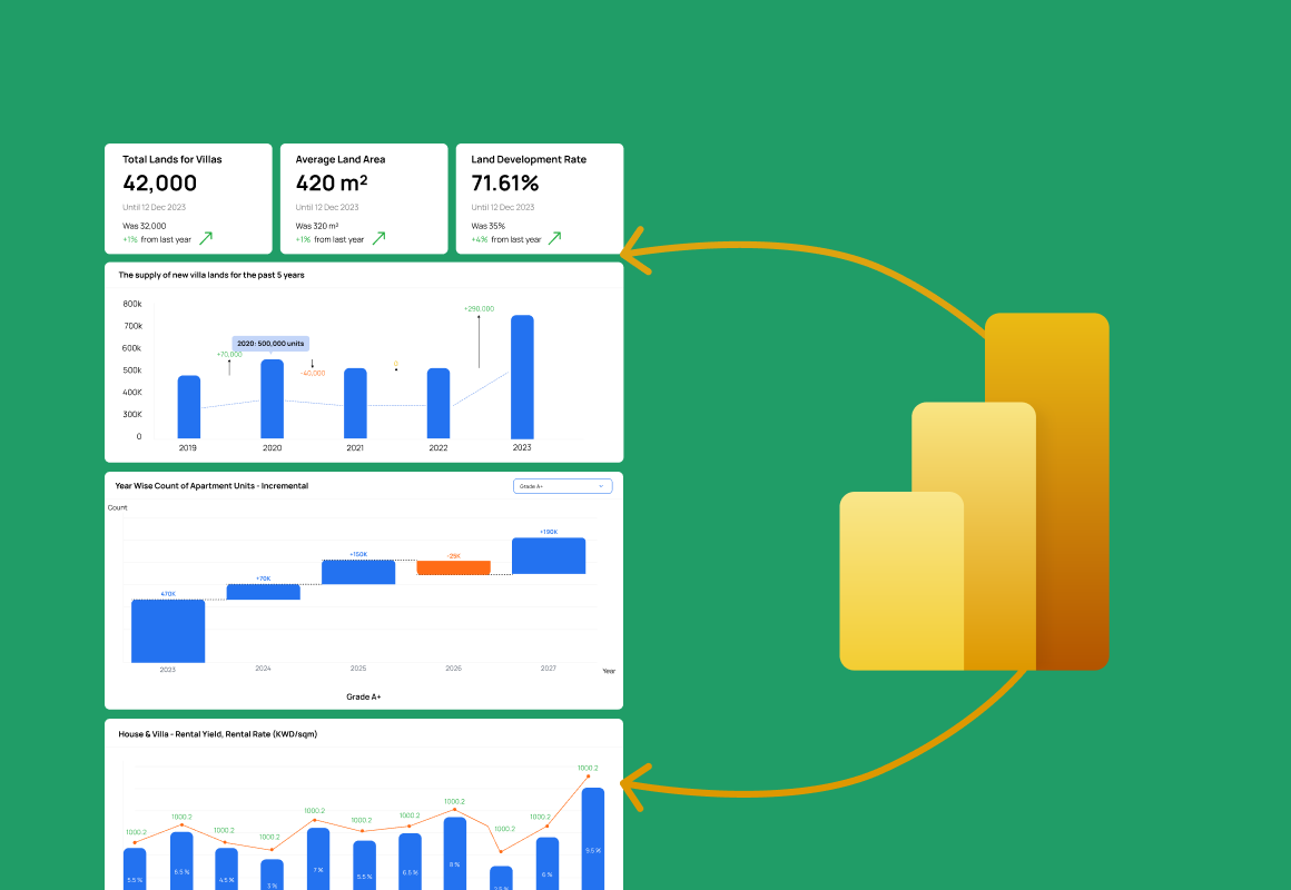
Enterprise clients weren't just using the product — they were asking whether they could access the data directly. Banks wanted to pull transaction data into their own risk models. Developers wanted to integrate location intelligence into their internal pricing tools. The data had standalone commercial value, and Markets had no mechanism to deliver it.
Value was locked inside the interface. It had nowhere else to go.
The product's strength had become a ceiling. Everything the platform knew — transaction prices, geographic patterns, zoning data — was only accessible through the Markets UI. There was no structured way to monetize that data independently, no path for clients to integrate it into their own systems, and no differentiation between users who wanted deep access and those who needed light usage.
Monetization can break the experience it's trying to fund. This had to be different.
The instinct with monetization design is to lock things behind paywalls, add interstitial upgrade prompts, and treat restrictions as the primary mechanism. But enterprise users are especially sensitive to friction — and a heavy-handed monetization layer would have damaged the product's reputation as a trusted professional tool.
The challenge was to introduce meaningful commercial differentiation without making the product feel like it was withholding value from its users. Monetization had to feel like an expansion of capability, not a reduction of access.
Three principles that kept monetization from becoming friction
There was real internal pressure to monetize aggressively — more gates, more paywalls, harder upsell prompts. I argued the opposite: for enterprise buyers, friction costs more trust than it earns in revenue. I owned the call to make premium capability visible-but-optional and let discovery drive conversion, and defended it across product, sales, and leadership.
Four solutions that turned data into a product line
Premium Map Layers
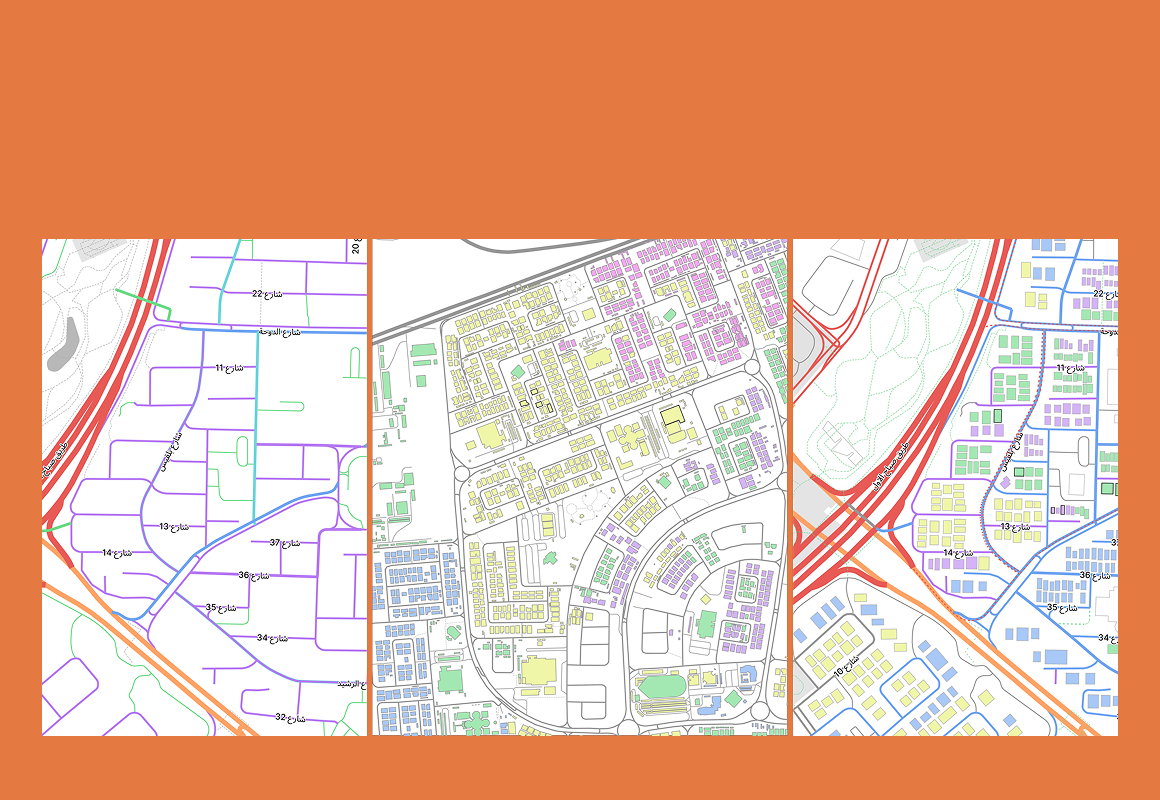
High-value datasets were structured as discrete, toggleable premium layers within the existing map interface. The layer panel showed all available layers — free and premium alike — so users could see what was possible before deciding whether to unlock it. Locked layers were visible but marked, with a clear path to access.
↑ 40% of enterprise accounts activated a premium layer within 3 months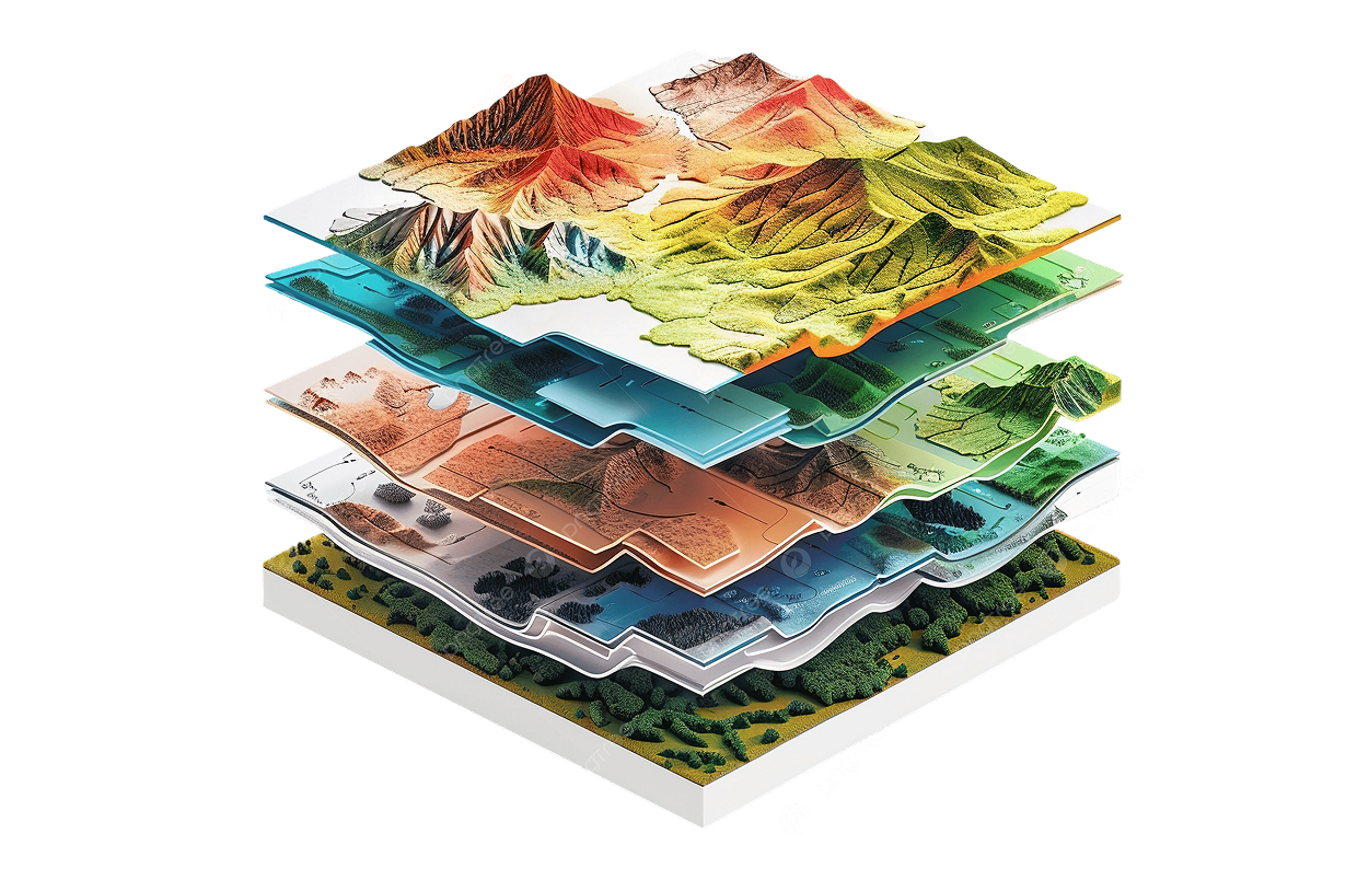
API-Based Data Access
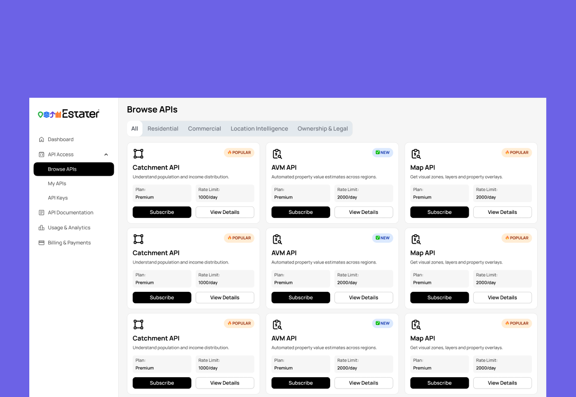
Designed the user-facing experience for Markets' data API — enabling enterprise clients to access transaction data, spatial intelligence, and market indicators directly from their own systems. The UX challenge was making a developer-grade API feel like an enterprise product feature, not a technical afterthought.
8 enterprise client integrations within 6 months of API launch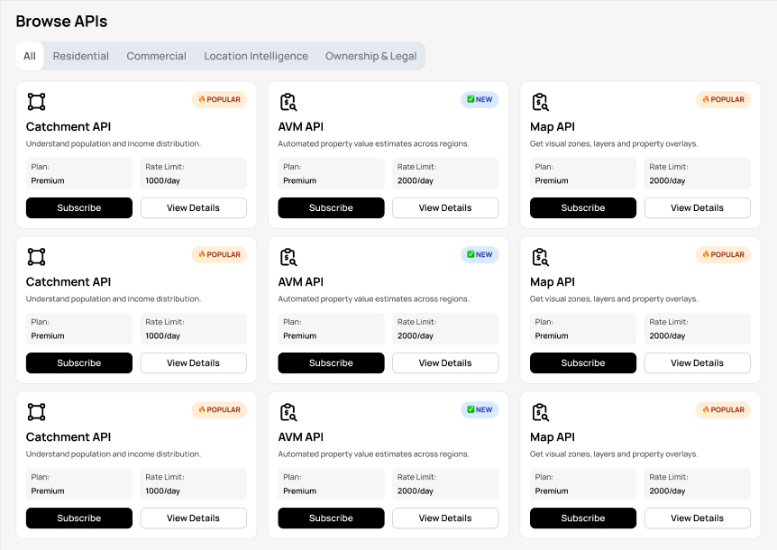
Seamless Upgrade Path
The upgrade experience was designed to feel like discovery, not restriction. Users moved from base access to premium capability through organic interaction with the product — finding a locked layer they wanted, understanding its value from context alone, and choosing to unlock it — rather than through an upsell funnel.
↑ 0 upgrade-related support tickets in first 3 months — the path was self-evident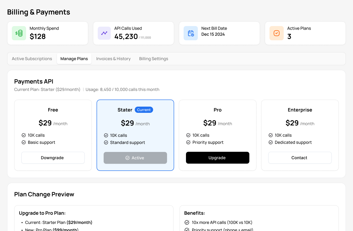
Platform Thinking: From Closed Tool to Data Ecosystem
The most important design work in this project wasn't a screen or a flow — it was a conceptual shift in how Markets understood itself. The product moved from thinking of value as "what users can do in the UI" to "what users can do with the data, wherever they need it."
↑ 35% increase in average contract value post-platform repositioning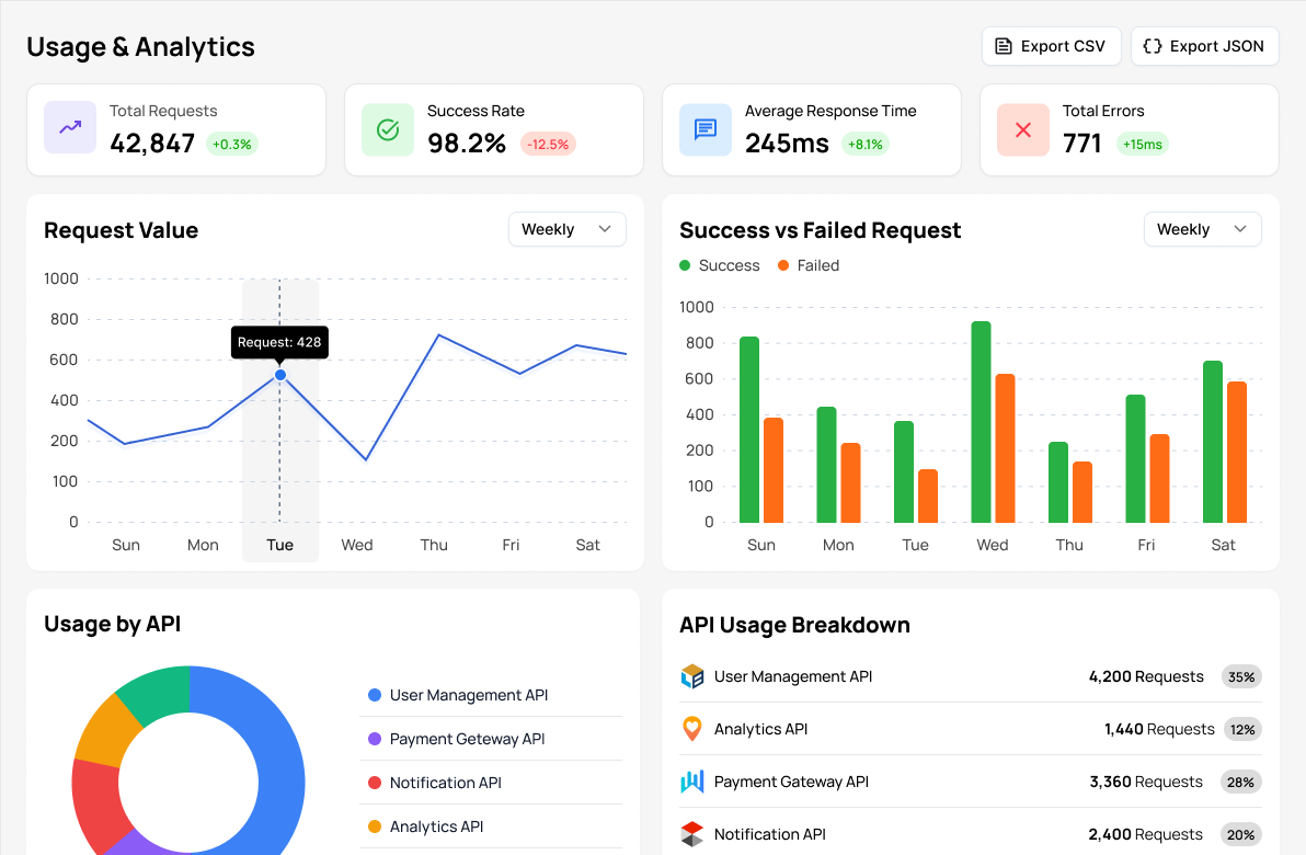
A new business direction unlocked. Not a feature — a model shift.
This project's impact wasn't measured in user satisfaction scores. It was measured in new revenue lines, expanded contract structures, and a product that could grow revenue from existing clients as well as new ones.
Premium layer subscriptions and API access fees created recurring revenue from the data itself — separate from the UI subscription. For the first time, Estater could monetize data access independently of product usage.
The tiered access model gave the sales team a legitimate, user-driven upsell path. Rather than asking clients to pay more for the same thing, they could point to tangible new capabilities — premium layers and API access — that clients were already asking about.
The API and bulk data offering opened conversations with a different category of buyer — data engineering and integration teams at larger organizations — who wouldn't have considered a UI-only product. The platform positioning changed who would even take the meeting.
A product that only sells access to an interface is one step away from being replaced by a better interface. A platform that delivers proprietary data via API becomes embedded in client workflows — dramatically increasing switching cost and long-term retention.
This is the kind of design work most portfolios don't show.
Designing for monetization requires understanding how business models work, how enterprise clients make purchasing decisions, and how product design can either enable or undermine both. It's a layer of thinking that goes beyond wireframes and flows.
The hard parts that don't appear in the final design
Good monetization doesn't interrupt the experience — it extends it.
When designed well, users don't feel like they're being charged. They feel like they're unlocking more power. That distinction is entirely a design problem — and it's one of the hardest ones to get right.
The most important lesson from this project was that monetization and user experience are only in tension when monetization is designed carelessly. A gate that appears mid-task feels like a punishment. A layer that's visible but locked — with a clear story about what it unlocks — feels like an invitation. The difference between those two experiences is entirely a design decision.
I also learned that the most valuable thing a designer can do in a monetization project is shape how the product thinks about value — not just how the paywall looks. If the tiers are wrong, no amount of upgrade UX will fix the conversion problem. Getting the structure right is upstream of everything else.