Markets × Meter
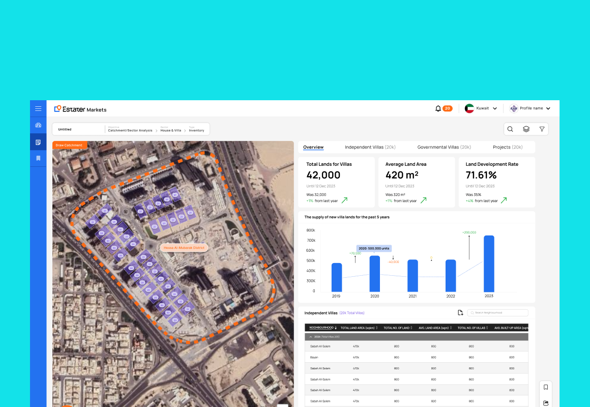
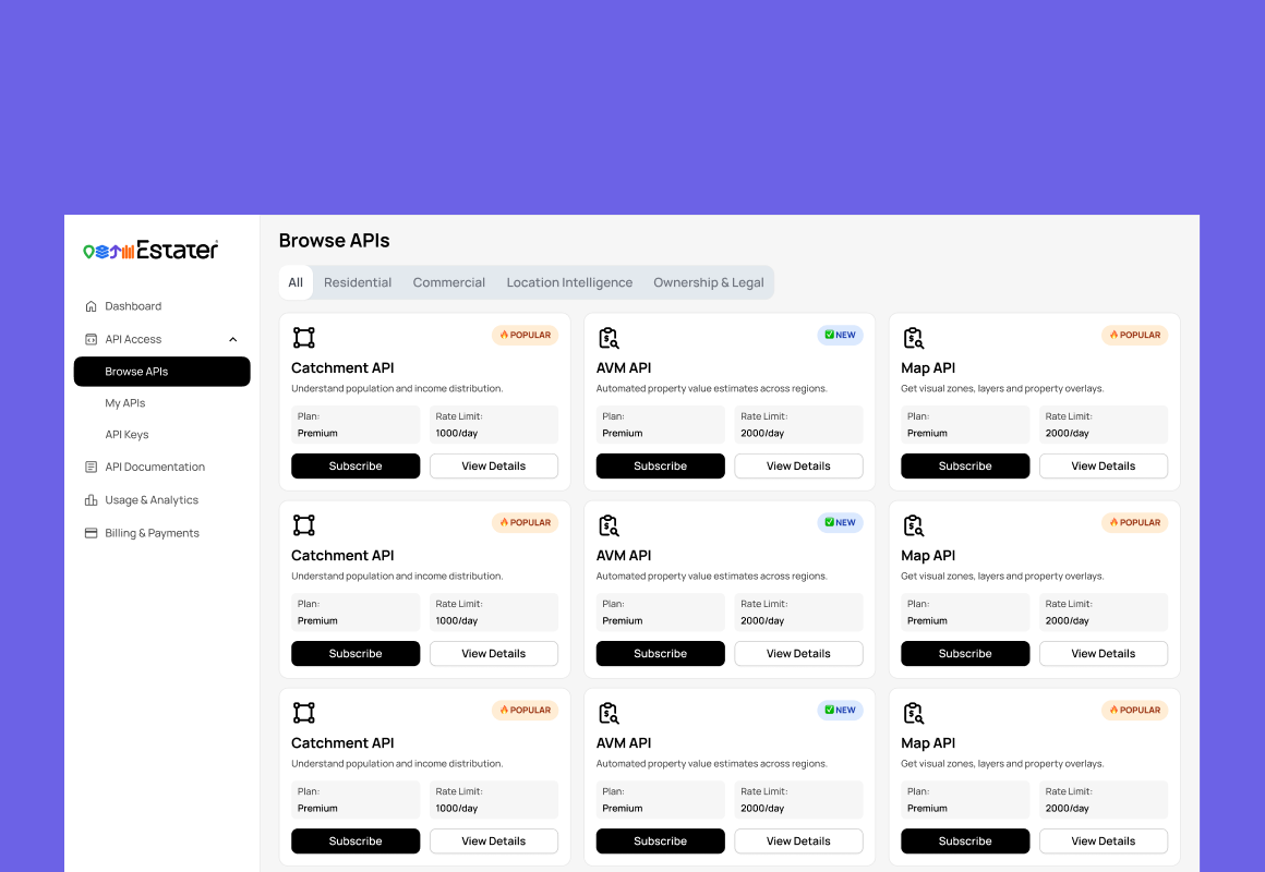
A company-wide rebrand became the moment to unify Estater's two core products. As Design Lead, I directed a team of nine designers — working alongside engineering, product, and the founders — to overhaul Markets and Meter under one new visual language and Estater's first shared design system, rebuilding 200+ screens in two months.
Two products. Two visual languages. One user navigating both.
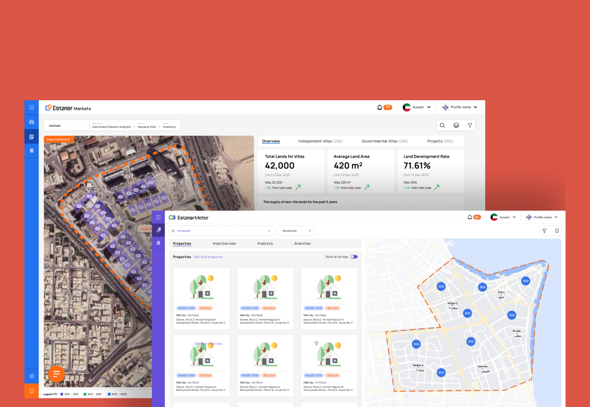
The rebrand redefined Markets first — a modern analytics platform with a polished new visual language. But Meter, the other product in the Estater suite, still ran on the old UI. The two products didn't just look different; they felt different: different component styles, different interaction patterns, different visual rhythms — now pulling against a single new brand.
For enterprise users who worked across both products daily, this fragmentation wasn't aesthetic — it was a real usability cost, and it showed. It came back to us directly in client feedback and from teams across departments: the two tools plainly looked and behaved like different products. Every switch cost users a small, compounding act of re-orientation.
Four symptoms of the same root cause: no shared design language.
Inconsistency between products isn't just a visual problem — it's a systems problem. The symptoms showed up in user experience, development velocity, brand perception, and the company's ability to scale multiple products at once.
Consistency without making two different products feel like clones.
The instinct with cross-product alignment is to make everything the same. But Meter and Markets serve genuinely different workflows — and if Meter was made to feel exactly like Markets, users would correctly sense that something was off. My job was to find the right layer to standardize, and to defend it against the constant pull to just make everything match.
Not every element needed to be shared. Navigation structure, data presentation patterns, and interaction models could be unified. But domain-specific UI — the components and layouts unique to each product's function — needed to stay tailored. Getting this distinction right was the core design problem.
How do you make two different products feel familiar to the same user — without making them feel identical?
| Element | Approach |
|---|---|
| Color system & tokens | Fully shared |
| Typography scale | Fully shared |
| Navigation structure | Fully shared |
| Spacing & grid | Fully shared |
| Filter interaction model | Fully shared |
| Data table patterns | Shared pattern, adapted layout |
| Card & panel components | Shared base, product-specific content |
| Domain-specific dashboards | Product-specific |
| Meter-specific data views | Product-specific |
Three principles. One rule: build a system, not a copy.
The strategic framing mattered: this wasn't a Meter redesign that happened to reference Markets. It was the beginning of a multi-product design system, with Meter as the first product to adopt it after Markets had established the patterns.
With a two-month deadline and no system to inherit, I chose to build the shared token layer first — before a single Meter screen was redesigned. It slowed visible progress early and I had to defend that with the founders, but it made consistency structural instead of cosmetic. The harder call was where to stop unifying: I set an explicit shared / flexible / product-specific rule so two product teams had a framework to decide by — not a fresh argument over every component.
Tokens first. Before any screen was redesigned, the underlying system had to exist.
Design systems work fails when it starts with components. Components are built on decisions that need to exist first — color, spacing, typography, elevation. I extracted the implicit decisions already made in Markets and made them explicit as shared tokens that Meter could adopt.
These tokens defined the shared atomic layer — the decisions that cascaded through every component in both products. Establishing them before touching any Meter screen ensured consistency was structural, not incidental.
Four solutions that made two products feel like one ecosystem
Visual Alignment with Markets
Applied the shared token system across Meter's entire visual layer — typography, color, spacing, border radius, and elevation. The goal wasn't to make Meter look like a Markets screenshot, but to make the same designer's hand legible across both products.
120+ UI inconsistencies catalogued and resolved across both products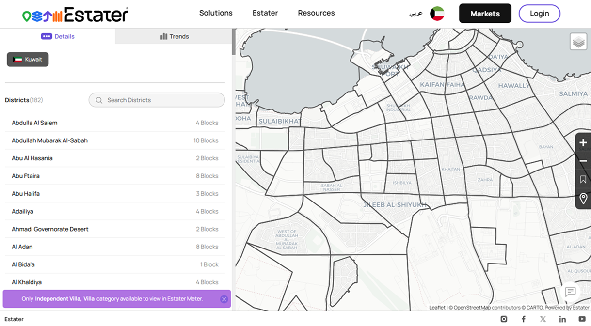
Standardized Layouts
Introduced consistent structural patterns across both products — how pages were organized, how navigation was positioned, how data was presented within containers. In the rebuilt Meter: navigation 95% shared, page layout 90% shared, filter system 85% shared, data tables 55% shared + 35% adapted, and domain views 65% Meter-specific by design.
85% of Meter's UI rebuilt on the shared component library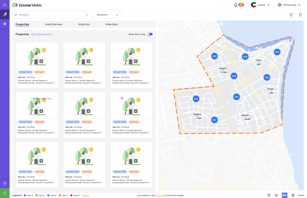
Unified Interaction Patterns
Alignment at the interaction level is harder than visual alignment — and more impactful. I mapped every key interaction in Markets and applied the same logic to Meter: dropdown-only filters became Markets-aligned chips and panels, full page reloads became live filter updates, panel state now persists across sessions, tab-only navigation became a sidebar matching Markets, and keyboard behavior became consistent.
45% faster orientation for users moving from Markets to Meter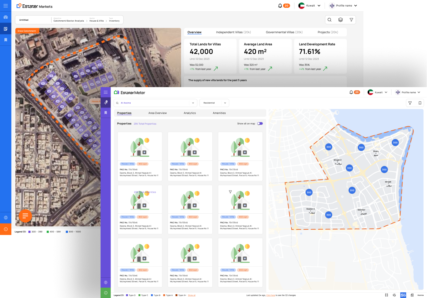
Foundation for the Design System
Every decision made during the redesign was captured so it could become the system: a shared Figma component library with variants, states, and usage guidelines; token documentation with Figma and code references; an interaction pattern library with annotated specs for engineering handoff; and a consistency/flexibility decision framework for future products.
3× faster to design new Markets & Meter screens with the shared library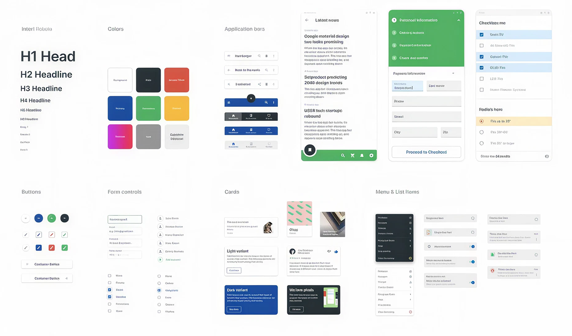
What cross-product navigation feels like now:
Consistency as a product feature. Not just a design preference.
The payoff of this work was distributed — it showed up in how users moved between the two products, how fast engineering could ship, how coherent the rebrand felt to clients, and in the company's capacity to scale future products without scaling design and engineering debt at the same rate.
Enterprise users working across both products reported faster orientation and fewer instances of "I can't find where that is" — because the structural logic of both products now followed the same rules.
Shared components meant engineering teams could implement Meter features using established patterns rather than building from scratch. The reduction in decision overhead during handoff translated directly to faster shipping.
For enterprise clients evaluating Estater as a strategic data partner — not just a single tool — the visual and behavioral coherence across products signalled organizational maturity. A fragmented product suite communicates organizational fragmentation.
The token system, component library, and consistency framework created in this project weren't just used for Meter — they became the starting point for any new product Estater would build. The investment in the system paid forward.
A rebrand across two products, nine designers, and every department.
This wasn't a solo systems exercise. The unification rode on a company-wide rebrand, so I sat on the stakeholder team alongside product, engineering, sales, and the founders — turning client and internal feedback into design decisions the whole company could commit to. I led nine designers through the overhaul, set the shared standards, and reviewed both products against them so the system actually held under a two-month deadline.
What made this deceptively hard
Consistency is not about making everything identical. It's about making everything feel familiar.
Users don't compare products side by side. They carry patterns in memory — the layout structure, the filter behavior, the visual rhythm. Alignment at that level is what makes an ecosystem feel coherent. Everything else is just matching colors.
The most important thing I learned from this project: design system work is ultimately about trust — the trust a user builds with a product over time, expressed as muscle memory and reduced cognitive load. Every aligned interaction is a small deposit into that trust account. The goal of a design system is to make those deposits automatically, across every product in the suite.
And the system artifacts outlast the screens: the Markets and Meter screens will keep evolving, but the token system, component library, and consistency framework became the starting point for every Estater product built after them.