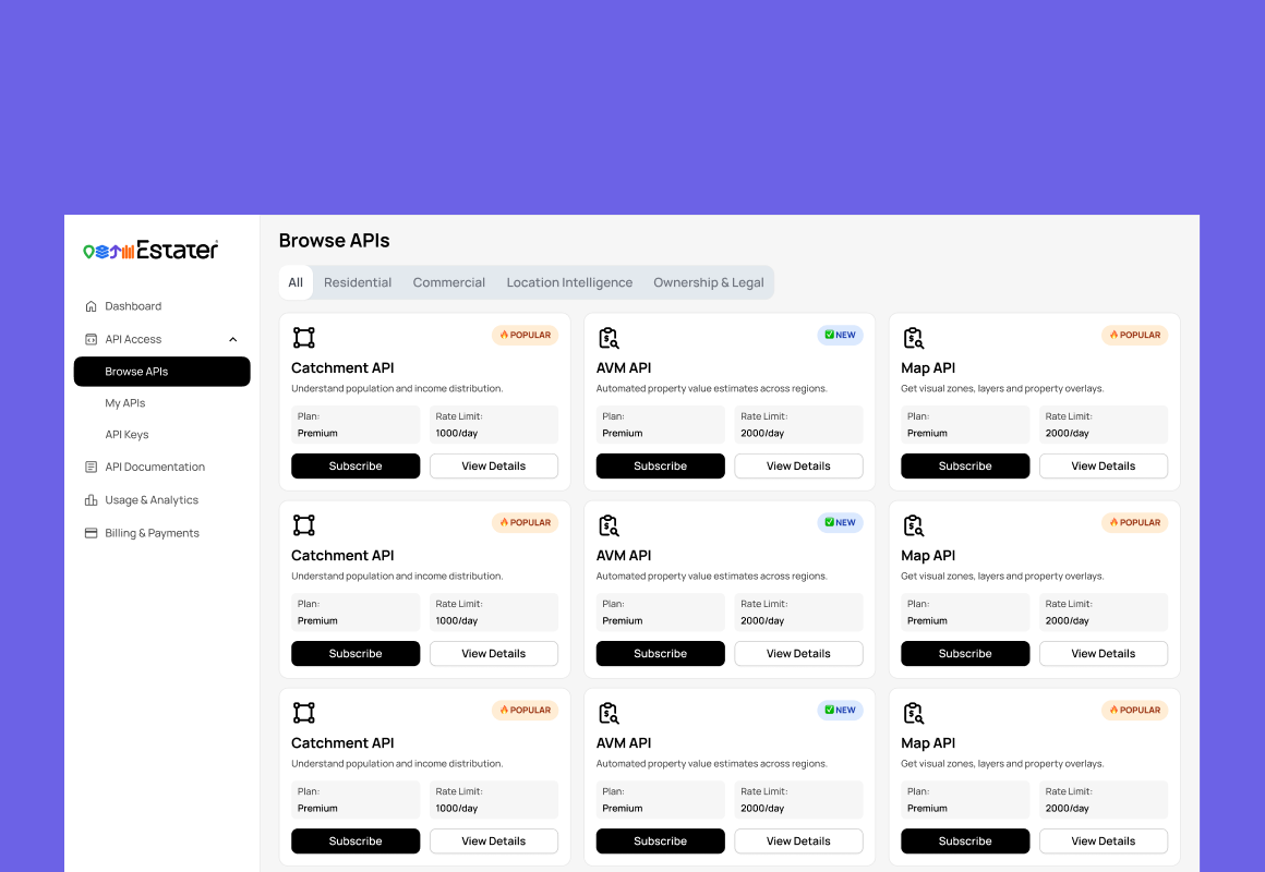
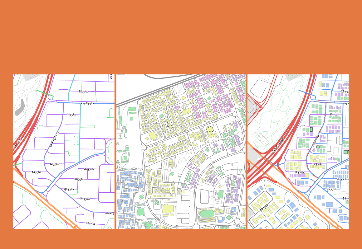
Estater Markets
Led the end-to-end transformation of a legacy reporting product into a modern self-serve analytics platform — serving banks, ministries, valuators, brokers, and developers across the Gulf.
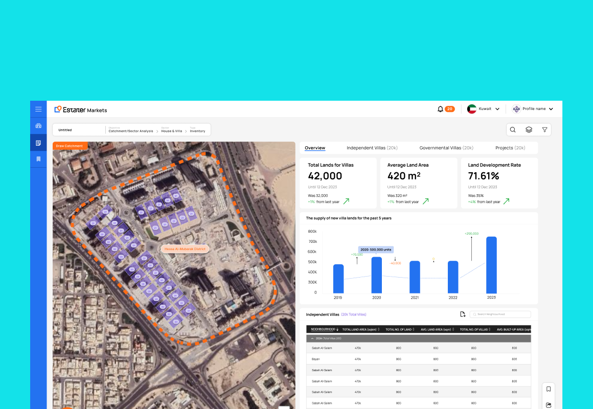
A reporting tool masquerading as a platform
When I joined Estater in 2022, Markets was primarily a static reporting tool. Users selected a report type, applied filters, and viewed tables and charts. The experience functioned more like a PDF on a screen than a modern analytics platform — capable on the surface, but fundamentally passive underneath.
For enterprise users making high-value investment, regulatory, and development decisions, the product created friction at every stage of their workflow — and had no room to grow with their needs.
Six constraints. One pattern: the product worked against its users.
Each limitation compounded the others. For enterprises making high-stakes financial and planning decisions, the accumulated friction wasn't an inconvenience — it was a blocker.
First in-house designer. Full product ownership.
I joined as the sole product designer — which meant not just designing screens, but defining what the product should become, coordinating directly with engineering, and eventually building the internal design function as the company scaled.
The reframe that unlocked everything
Rather than proposing UI improvements to the existing structure, I made the case for a more fundamental repositioning of the product — one that redefined what Markets was for, not just how it looked.
This repositioning was the decision that made every other solution possible. Without reframing the product's purpose, the dual-mode layout, spatial intelligence, and self-serve sandboxing would never have been scoped or approved. The strategy didn't just change the design direction — it changed the product roadmap.
The easy path was to polish the existing screens. Instead — as the first and only designer, with no PM buffer — I made the case to leadership and engineering to reposition Markets from a report viewer into an intelligence workspace. That reframe is what put the dual-mode layout, spatial intelligence, and self-serve sandbox on the roadmap at all.
Four interventions that changed how users access intelligence
Map + Panel Dual Workspace
Introduced a flexible, toggleable layout system with three working modes — Map Only for geographic exploration, Panel Only for data-heavy review, and Split View for both simultaneously. Users could shift between modes based on the task at hand, rather than adapting to a fixed interface.
↑ Dramatically improved usability across all user types and tasks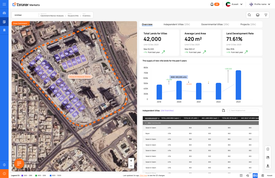
Interactive Spatial Intelligence
Added a full map-driven workflow with configurable data layers — heatmaps for transaction density, zoning overlays for regulatory context, geographic market views for macro analysis, and location-based drill-down for site-specific research. This transformed passive consumption into active geographic decision-making.
↑ Location-first workflows that were previously impossible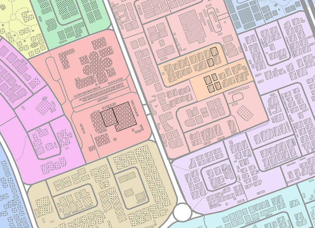
Two-Tier Filter Architecture
Redesigned the filtering system from a flat, confusing model into two clearly scoped tiers. Separating global from contextual filters eliminated the core usability failure of the original system — users always knew what was applied and why.
~35% reduction in filter-related support requests post-launch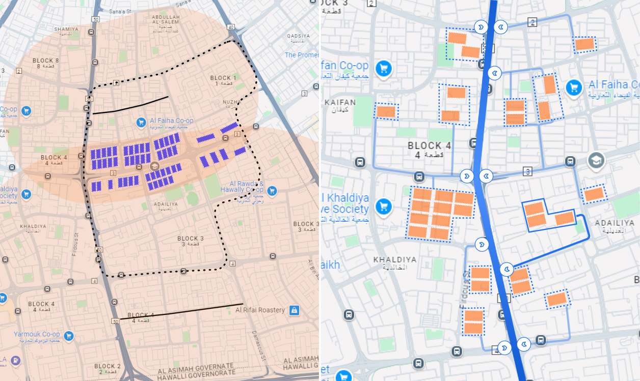
Self-Serve Sandbox Reporting
After the initial redesign gained strong adoption, Markets evolved further into a sandbox model — giving advanced users the ability to build custom studies, configure their own report logic, use prebuilt templates, and generate on-demand insights without waiting for preset reports.
68% of enterprise accounts adopted sandbox within 6 months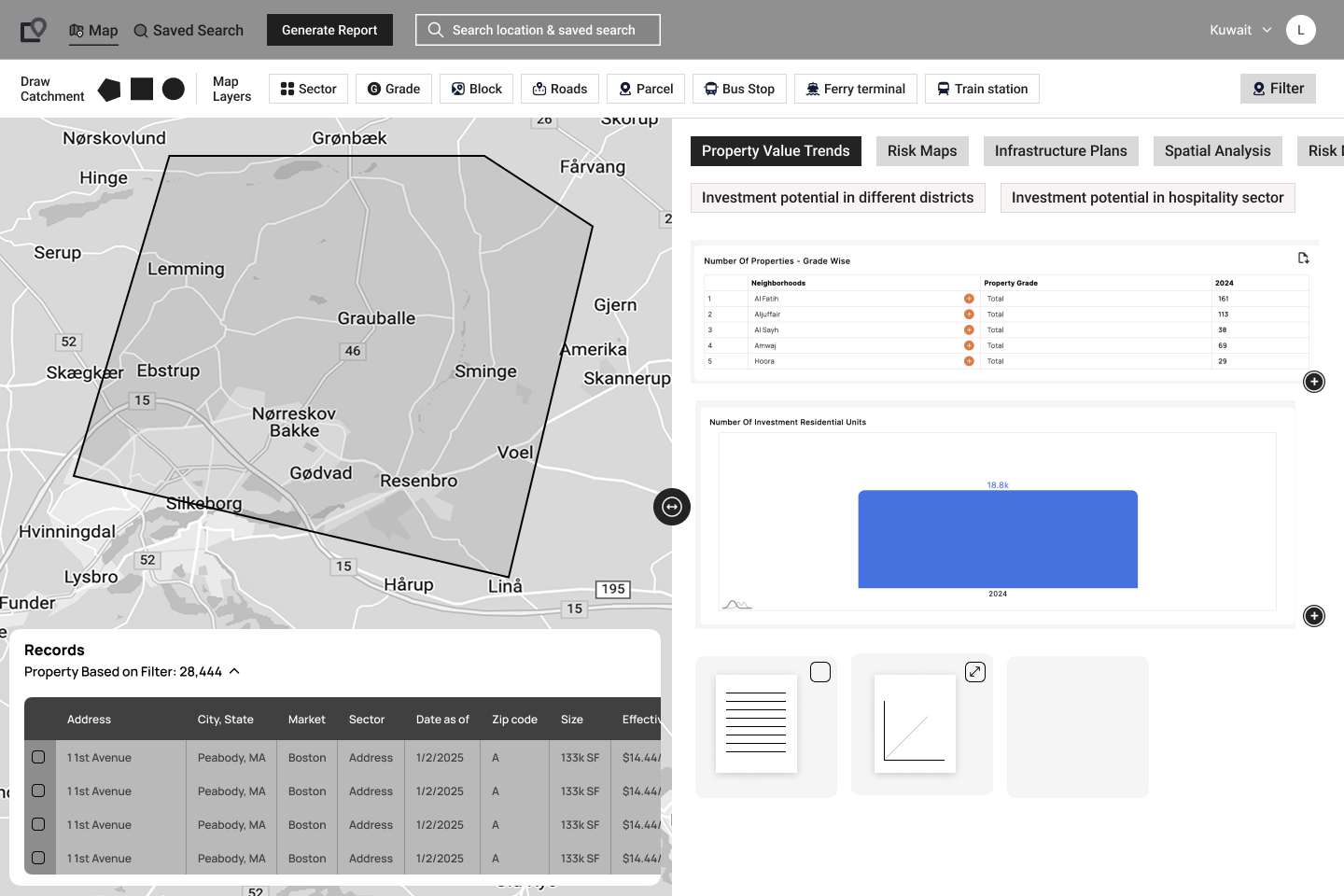
From product improvement to revenue growth driver
The redesign was well received by users across all five enterprise segments — and directly contributed to measurable product and business growth.
Enterprise sales cycles shortened as the platform's differentiated capabilities became demonstrably clearer during procurement evaluations and demos. The intelligence workspace framing gave the sales team a stronger, sharper narrative.
Repositioning Markets as an intelligence workspace — not just a data viewer — enabled higher contract values, longer retention, and conversations with clients who would have previously dismissed the product.
The sandbox model and tiered architecture created natural product-led upgrade paths and usage-based pricing opportunities that simply didn't exist in the original fixed-content structure.
Users at banks and valuation firms could now run multi-variable studies that previously required custom engineering work — dramatically reducing the product team's support burden while increasing user satisfaction.
What made this hard
Enterprise users don't just need dashboards. They need tools that adapt to how they think, investigate, and decide — not the other way around.
This project confirmed something I now treat as a foundational principle: the most important design question in enterprise software isn't "what should this screen show?" — it's "what does this user need to be able to do that they can't do today?" The answer to that question is what leads to real transformation, not incremental UI polish.
It also taught me that being the first designer in a company is a uniquely powerful position. You're not just designing — you're defining what design means to the organization, shaping what gets built, and setting a standard that others will build on long after you.